


The travel and hospitality industry has always been a very profitable market for businesses and a competitive one too. With the rise of brands such as Travel republic, Agoda and many others. Each one fighting for their own chunk of the market share. So in order to stay competitive, Expedia group had to revisit certain areas where its brand were struggling. Hotel.com, is one of its biggests, but had a dated ecommerce solution which was based on adaptive websites rather than responsive. With more users booking using mobiles than desktops it became a top priority for the business to address new challenges faced on the mobile platform and to produce a solution that ensured optimum user experience and sales performance.
As mentioned earlier, we worked hand-in-hand with the research and analysis team and had a lot of data to pull information from. This was based on earlier user and stakeholder interviews, web analytics, competitor reviews, field studies and usability tests performed. Over a period of time, this gave us invaluable insight and a good understand of our user base and the common problems faced with the older system.
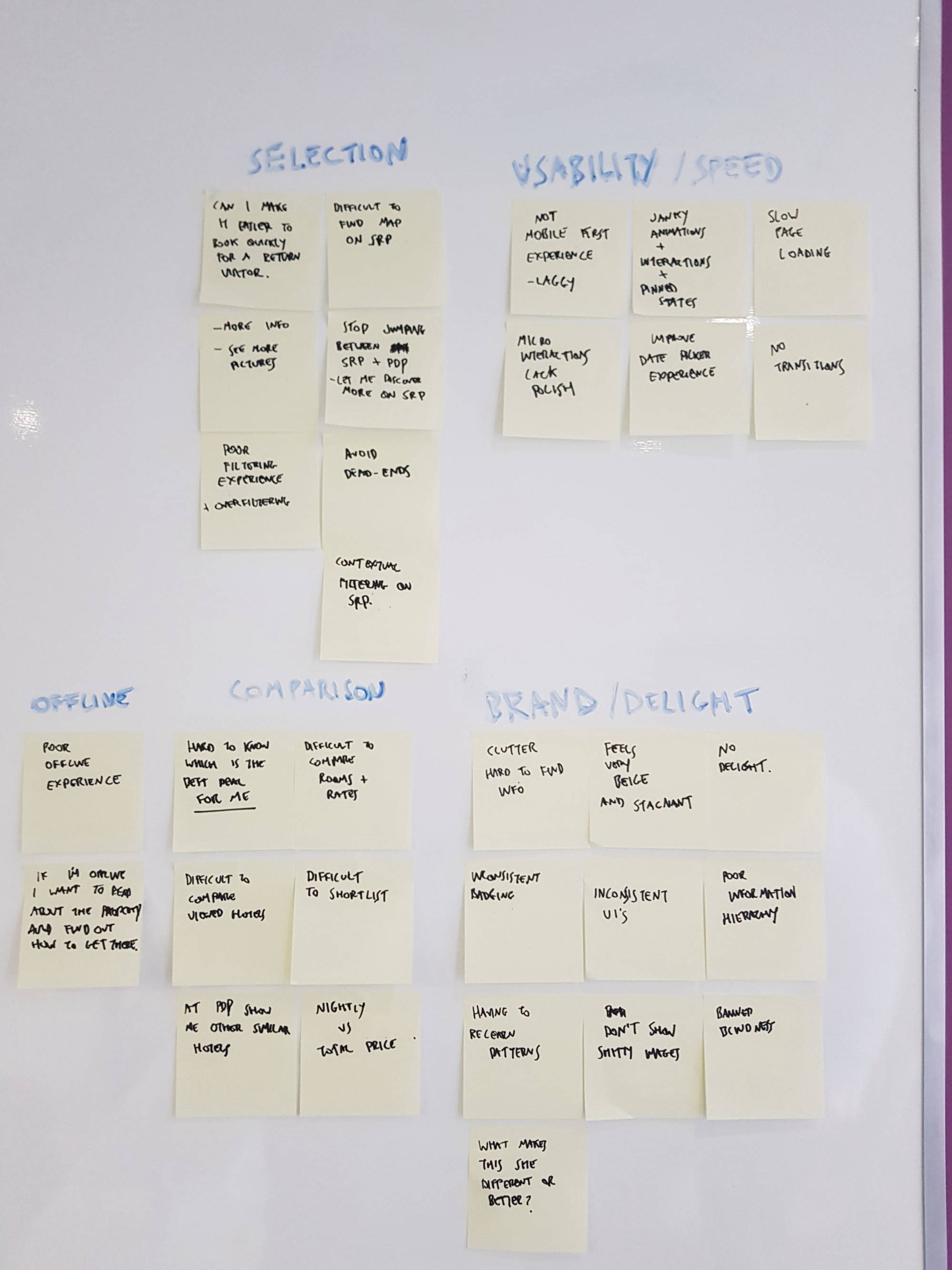
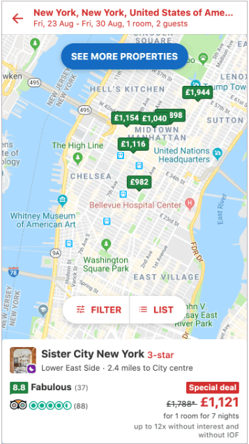
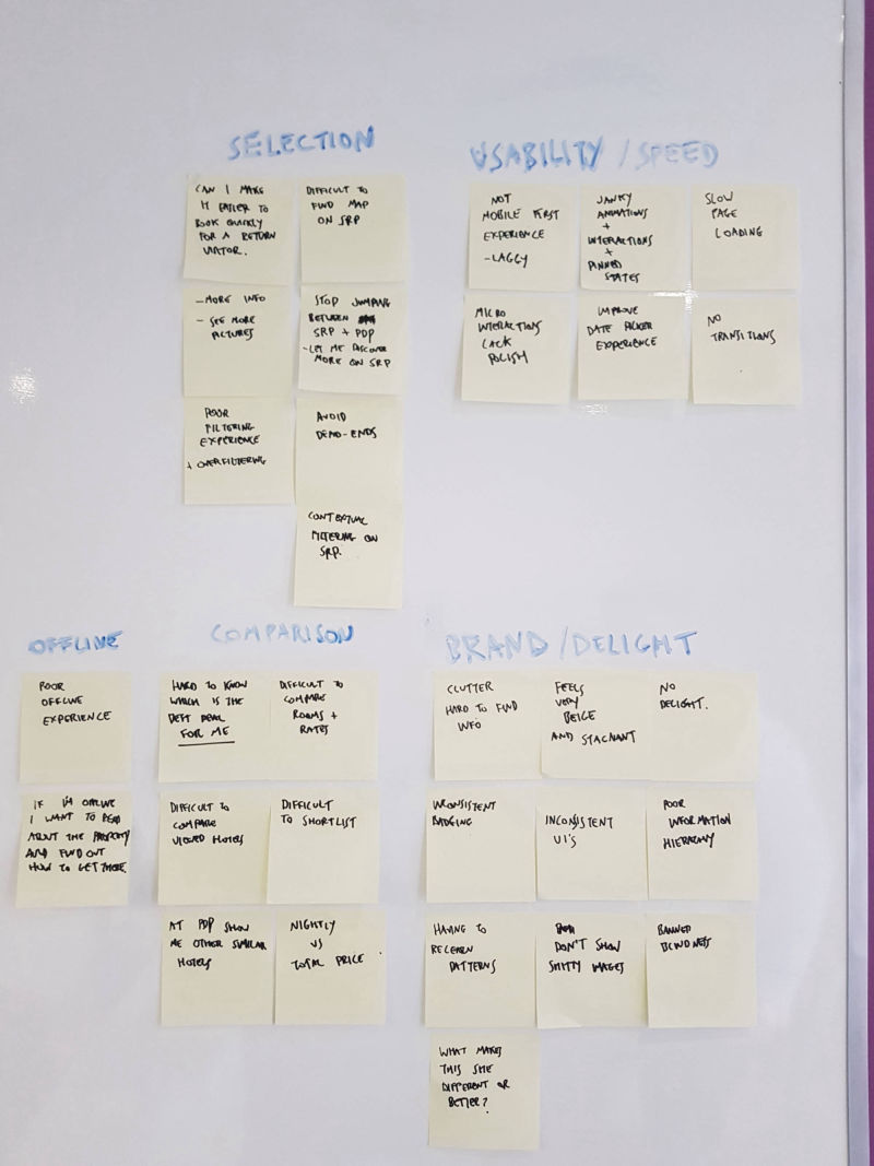
We were able to select specific user types based on demographics and produce personas with which to focus our study, We listed out user pain points and gains from the landing page to the checkout. We had brainstorming sessions where we produced JTBD drafts and explored the journey paths and steps to completing bookings. Also the journeys for our affiliates registering a vacation property. We looked at how best to optimize the layout of our search results page and hotel details page for mobile. We also looked at organic traffic and bounce rates. We worked with internal stakeholders from business strategists to sales, in order to ensure we complied with set requirements.
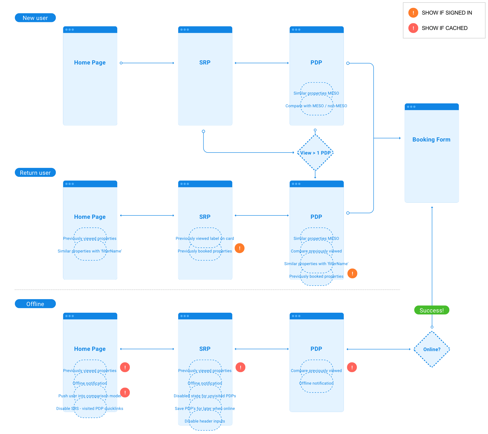
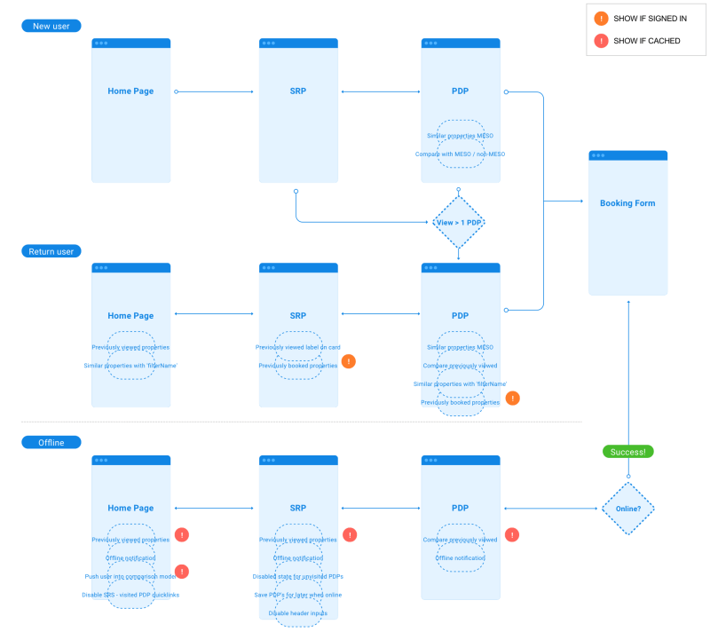
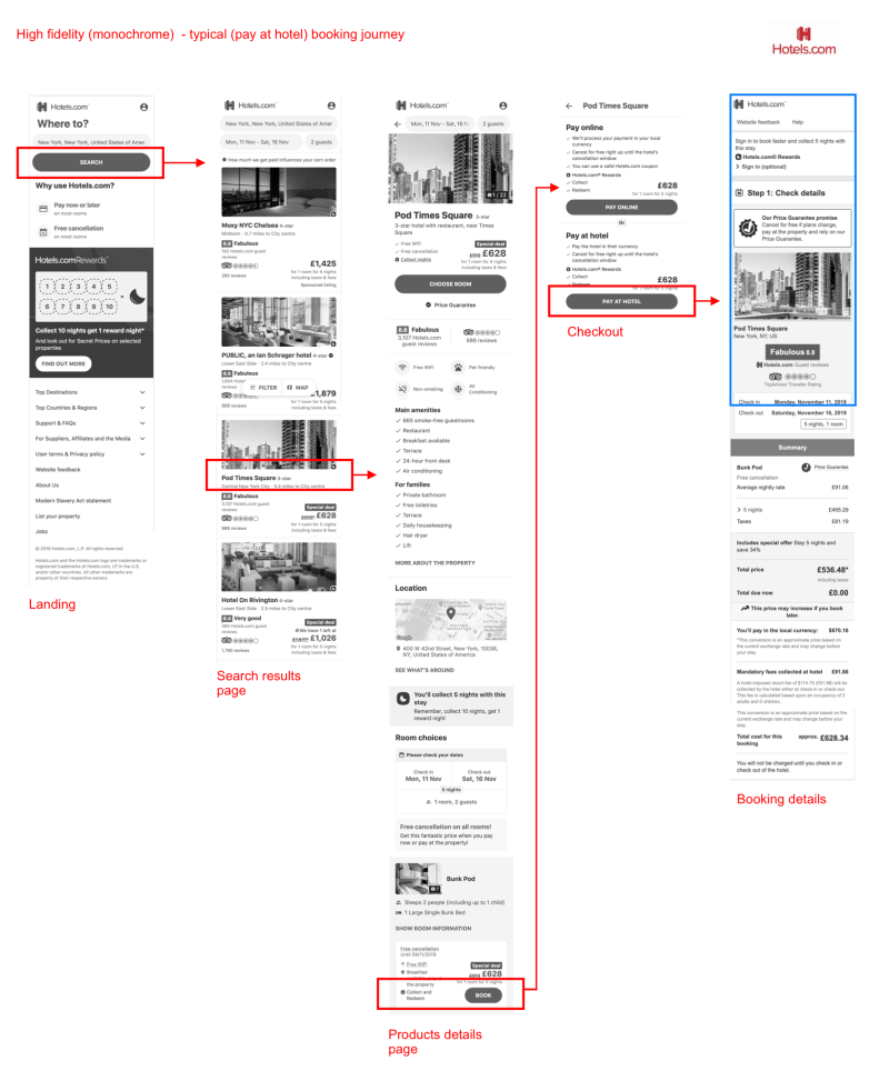
We produce process maps and task analysis diagrams. in addition, we produced user journey flows which helped us to break down and understand where users came from onto our landing pages, to learn what influenced their shopping habits from the product details page to the checkout. Also where and how we can drive or encourage users to progress to checkout and essentially the booking form to make a reservation.
After brainstorming and establishing a structure that will ensures a seemless experience for our users, We progressed to drafts and mockups. This was closely followed by low fidelity wireframes. Our designs were heavily influenced by the hotels.com brand guidelines, in-combination with tried-and-tested design methodologies also throwing-in commonly used styling which users are used to within the travel industry. We had an approach focused on simplicity and upon gaining a general concensus from the team and senior stakeholders, we were able to proceed to The look and feel, colors and visual presentation.
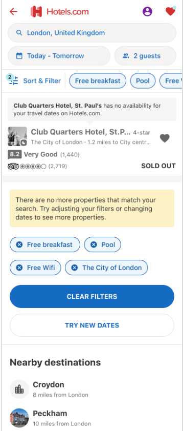
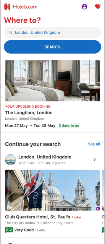
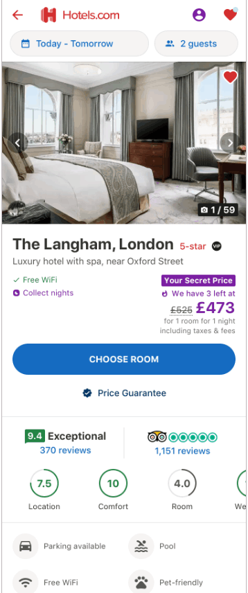
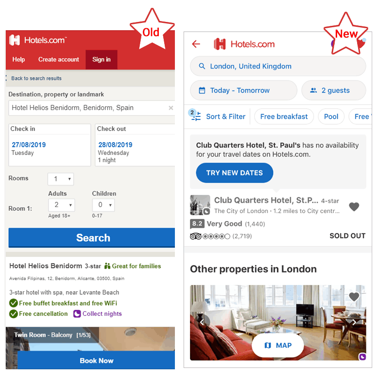
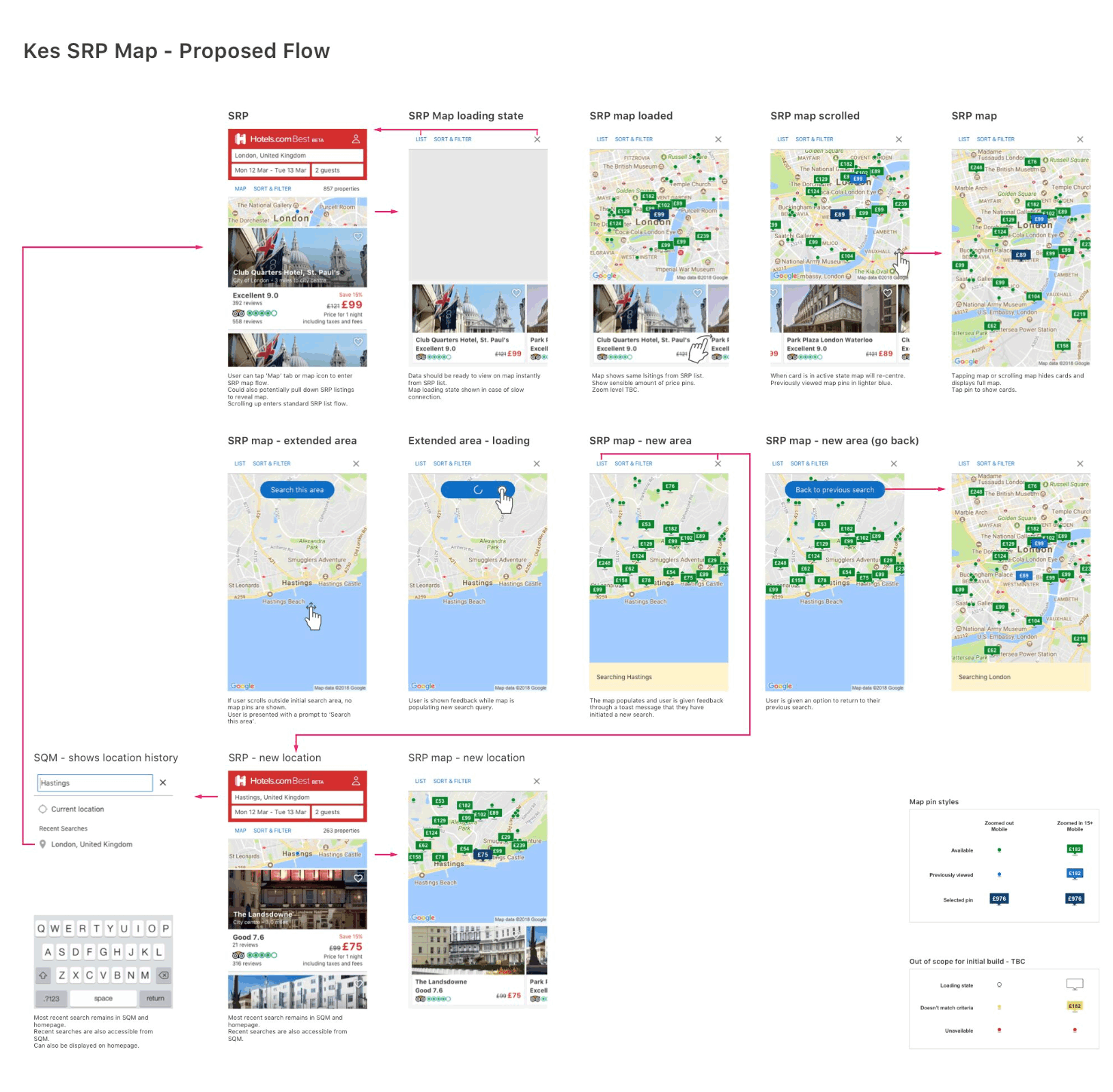
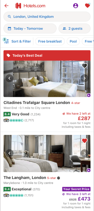
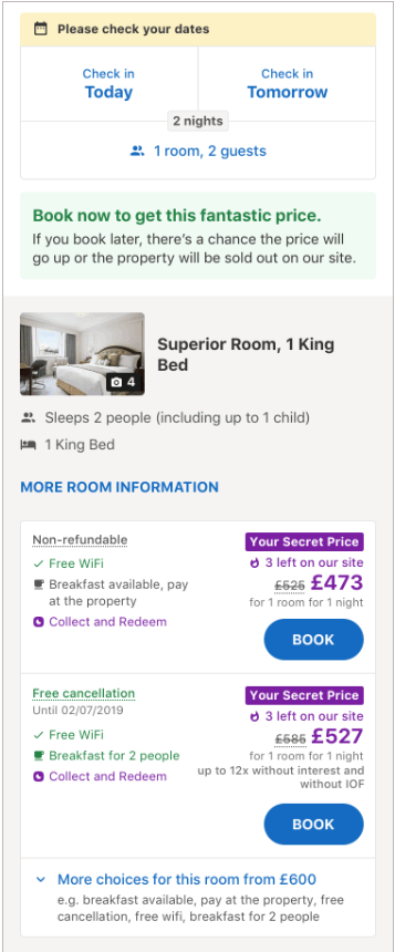
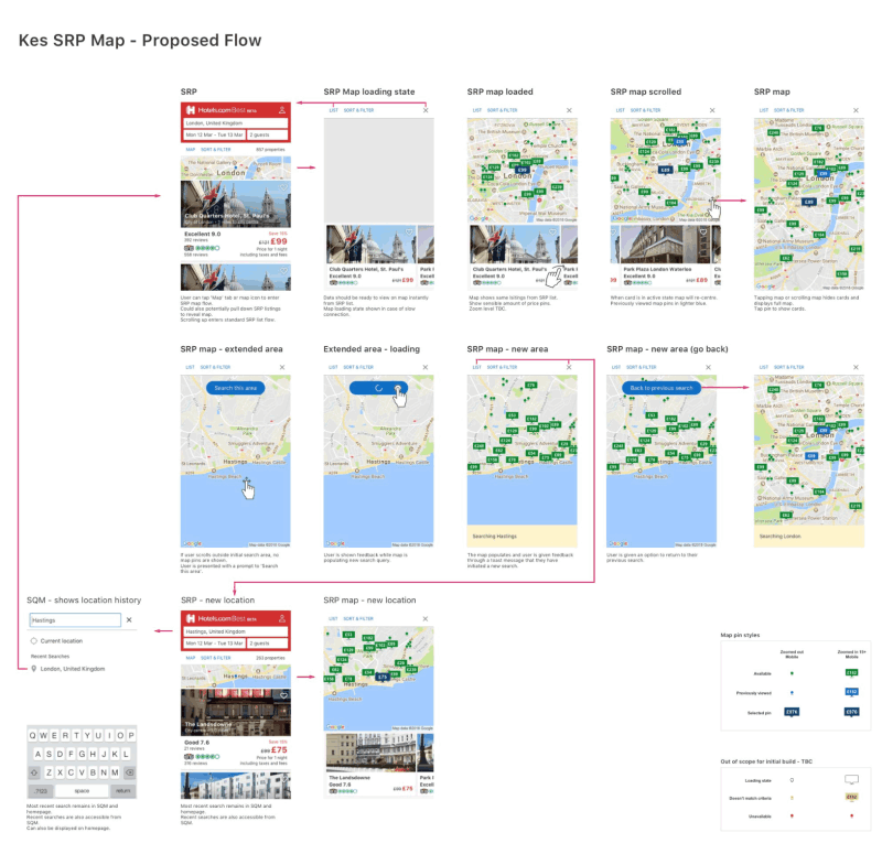
We often had to take a few steps back and scrap some ideas examples are hotel image gallery design. While needing to comply with standards and regulation, we also needed to ensure user obectives were simple to complete. We had dilemmas like enabling users to slide through images within the search results page - SRP (which lists the various hotels results from a search) or simp,y placing an image in the SRP and providing the gallery withing the product details page (which the user gets to when they click a search result). Such situations had us returning to the usability labs to perform further tests. We eventually progressed to High fidelity prototypes and unto clickable prototypes with which more indept usability tests were performed. This phase was just before we acquired final design sign-off, after which the development team commenced there work.