


Best Of Theatre (Which is owned by Encore Tickets) was an initiative to drive sales back to the business at a time when competition for ticket sales was rife. The business ran other brands (like LondonBreaks and TheatrePeople) that were performing poorly with less conversion than the competition. This would eventually affect its turn-over. Hence the project was charged with creating a new brand concept that will lead to securing a better share of a market that is worth over 2billion yearly. The business hadn't considered revamping the older website brands because they now had plenty of negative reviews in a number of forums and discussion boards. I worked as the UX designer and was involved from the very beginning where we selected a name. Naming is a very important part of brand creation and could play a part in its success. We wanted one that will be meaningful as well as memorable for the consumer - "Best Of Theatre".
To kick off, I was curious as to the poor reputation and proceeded to perform a review of analytics data on those sites. While reviewing the statistics I simultaneously visited the pages in question to see what faults they had (example: checking pages with worse user session durations and most drop-offs) It appeared that the product pages and order process were the culprits and had the most drop-offs. I documented my findings and summoned the team and stakeholders for a presentation where i shared this information. The most common and pertinent issues I found across the sites i had tested include the following:
- Purchase journey was long and most users will easily lose their patience
- Registration form had too many irrelevant fields, asking for information which we won't use, it shouldn't waste the users time by asking them to provide items like their job title, next of keen, etc.
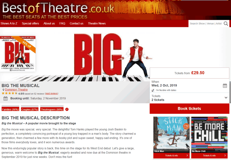
- The shows description copy was not particularly written in a manner to encourage users to make a purchase.
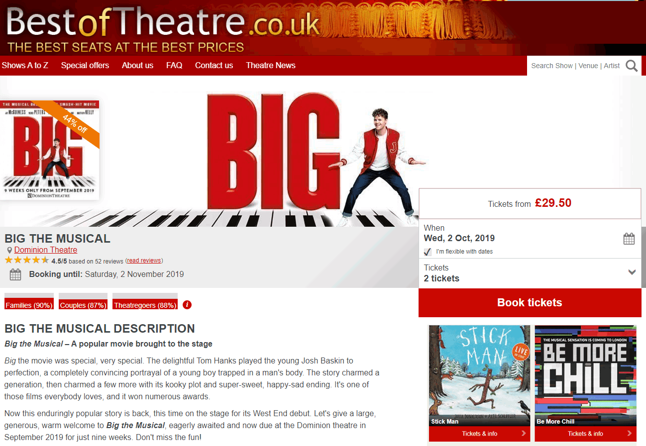
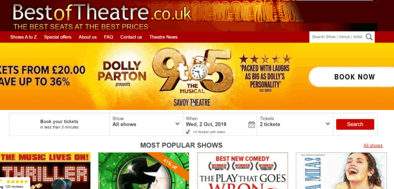
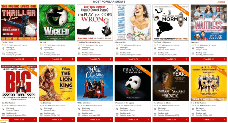
- The look and feel of the site lacked flare, and did not excite a user seeking to see a show. We should use relevant images and pictures from performances.
- A proper nav menu was non-existent except for 'about us' 'contacts' and 'sitemaps'.
- No information about running times in the shows description page
- Links to the reviews are present in some description pages and not in others.
- The call-to-action button for placing an order was not striking enough - considering its color.
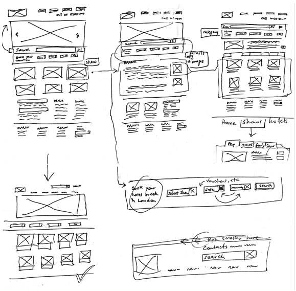
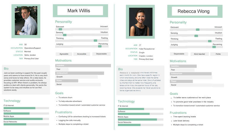
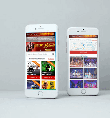
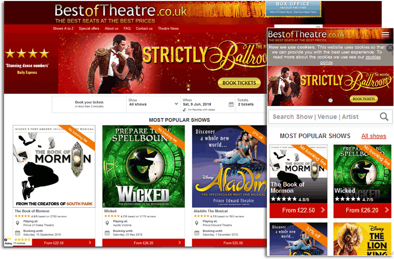
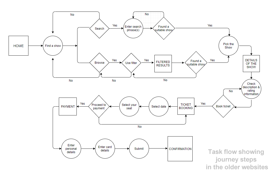
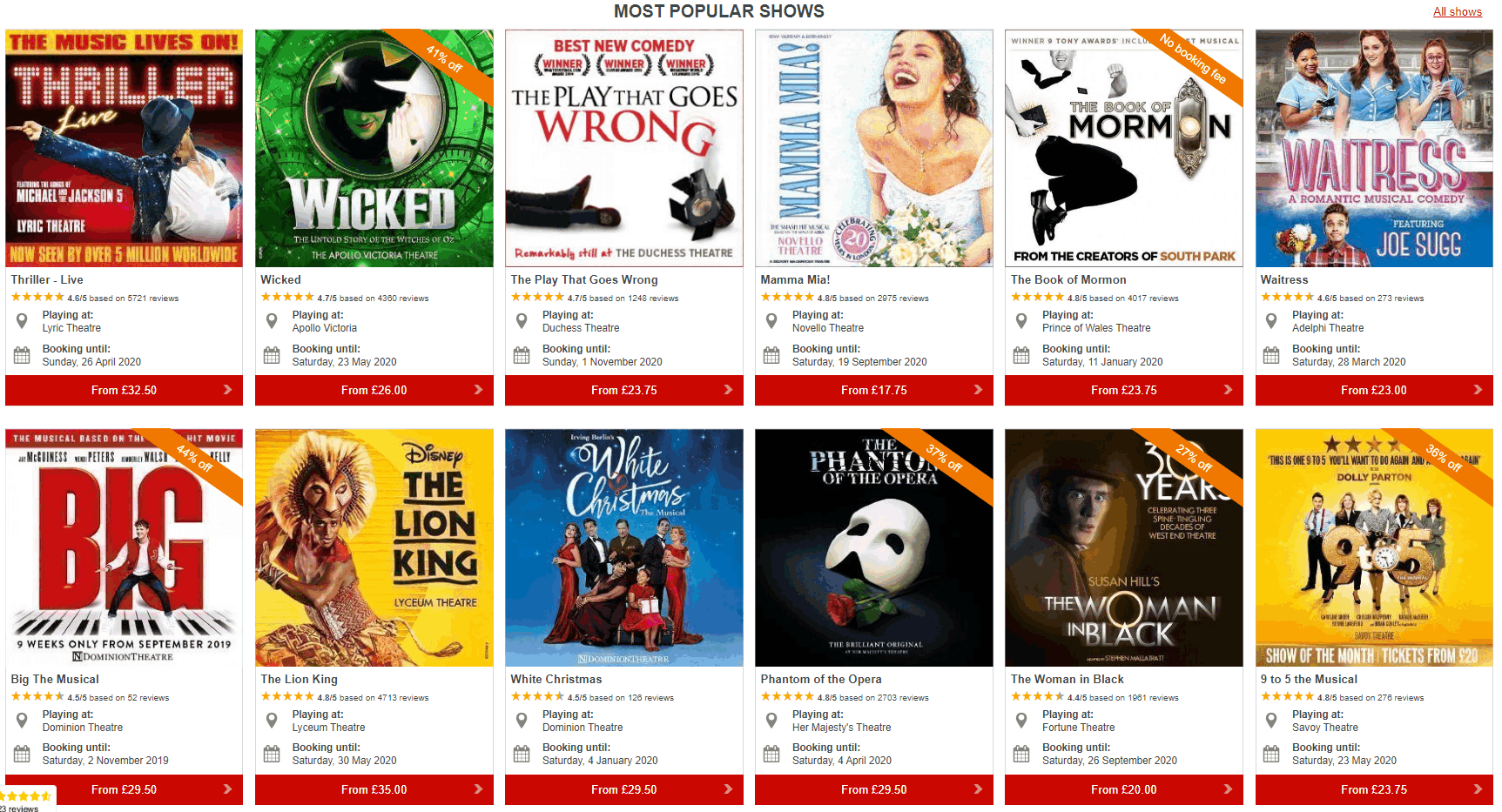
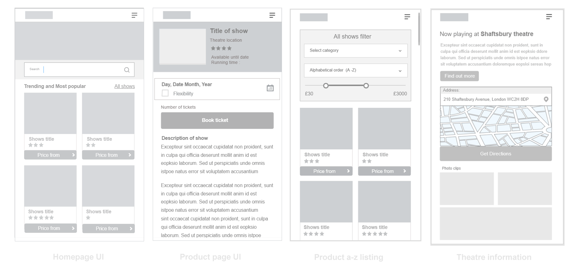
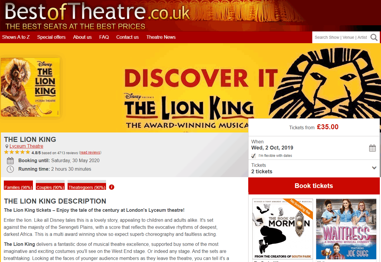
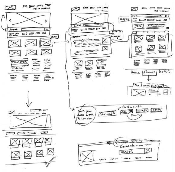
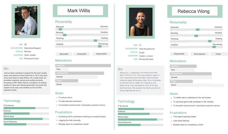
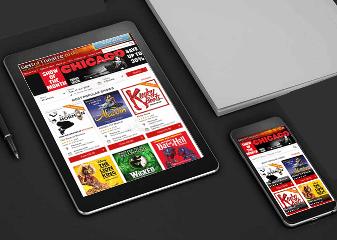
My team (consisting of a Visual designer, web master and project co-ordinator) met to plot a way forward. We had a brainstorming session where i proposed the UX strategy which was carried out in the following weeks. They included user interviews and user testing observation sessions. This was to verify my findings and ensure we were on the right track. We did this by recruiting volunteers to carryout tasks on the older sites (including purchasing tickets). In the end it was confirmed that 70% of the test subjects would bounce from the site. Afterwards, I created six personas to represent majority of our typical users. I then performed competitive analysis to learn what makes our rivals successful in order to capitalize in ways that will enable us outsell them. I noticed that most sites like ticketmaster and london-theatre-direct had a rich full width UI with immediate access to user's primary needs. (Search event by name or date). Also London-box-office. There was an emphasis on providing personalized search from the homepage. Most sites also placed accreditation and web ranking data to show their credibility. These and lots of other findings were shared back with the team for further brainstorming and discussions. I later proceeded to create process maps specifically user journeys and task flows to implement a quick and straight forward ordering process that can re-assure the user and possibly encourage a return visit when next they think about seeing a show. We were going to initiate a four step process. 1. Pick your show, 2. Pick your date 3. Pick your seat, 4. Checkout. Based on our user tests earlier, we ascertained that users often wanted to know the highest selling show of the current week or month. and with that, a list of the most popular shows. Considering the large number of shows, the homepage will use entire width area to reduce vertical scroll height. Images of the shows will be large (at least 270px height and width to present the graphics of each show in all its beauty, encouraging the user to click to find out more. These details were to be captured in the sketches and mockup which followed next.
This project showed me additional reasons why It is better to involve the developers from the early stages (when research deliverables are being reviewed). Though they are often reluctant to join so early and are usually busy on other projects. At least there should be a representative to provide insight on feasibility and technical knowhow. The benefit is noticeable when the project reaches development phase. Because the developers have been involved from the start, they know how the solution was formulated and things can go a lot smoother until deployment completes,