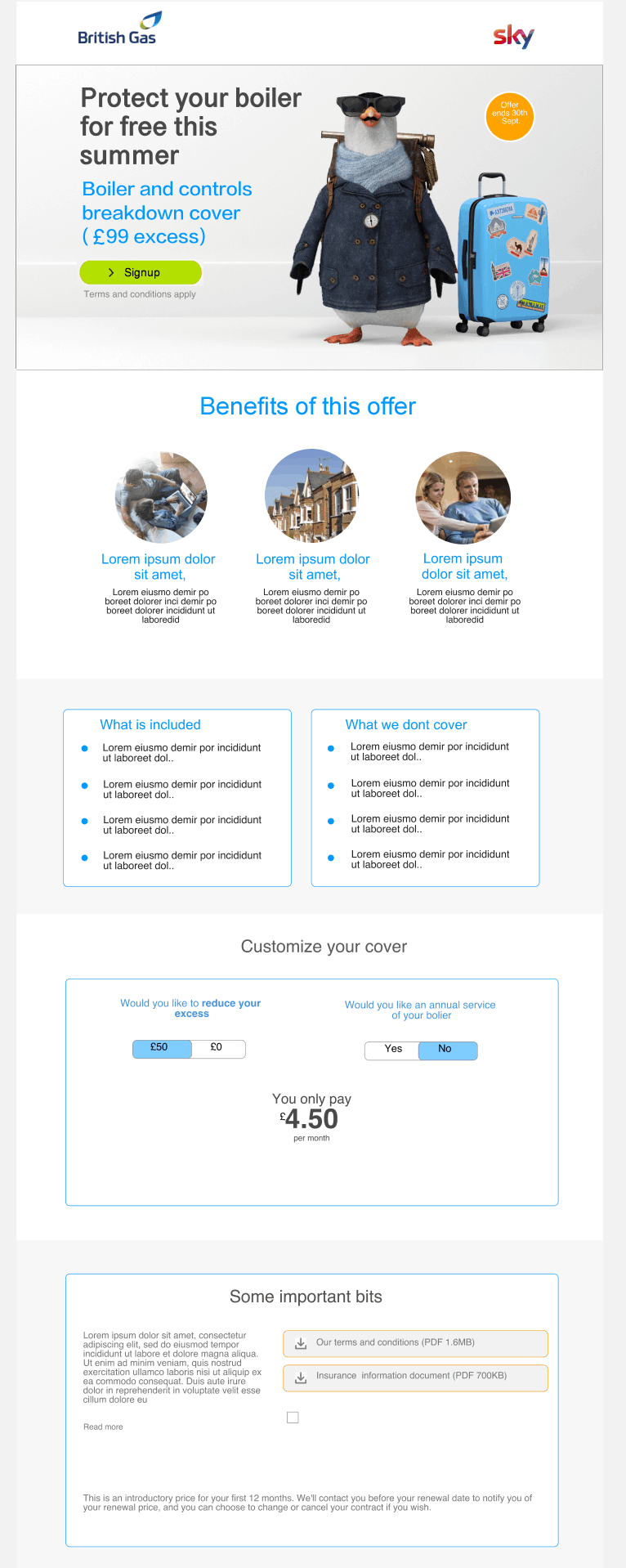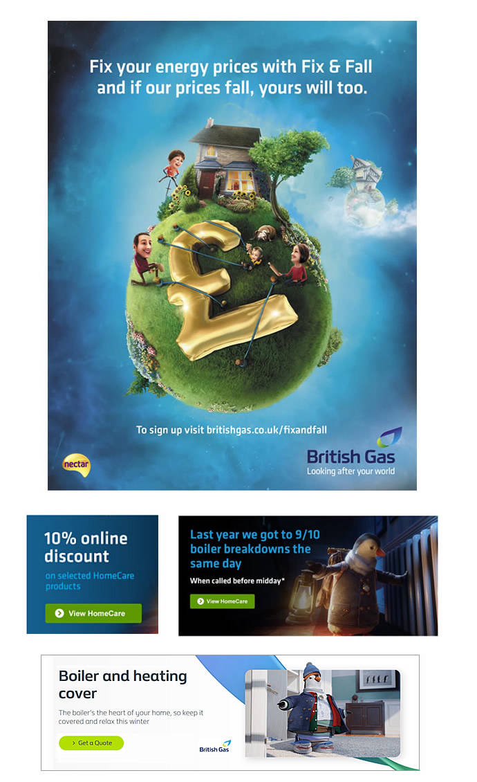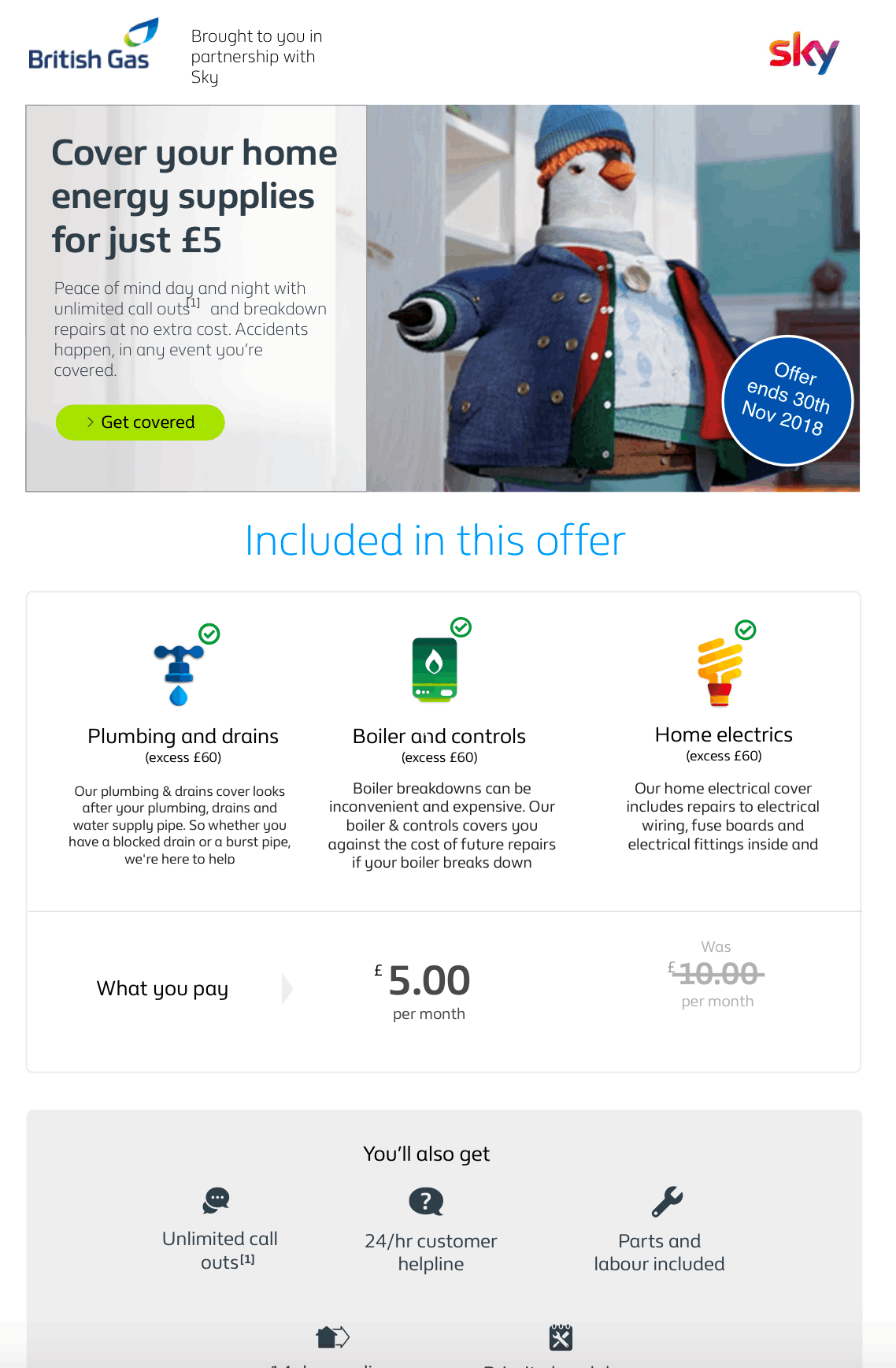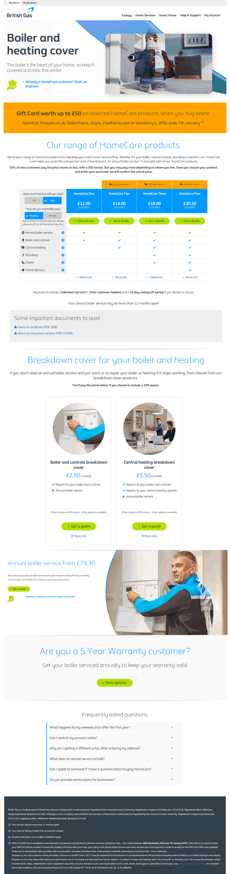

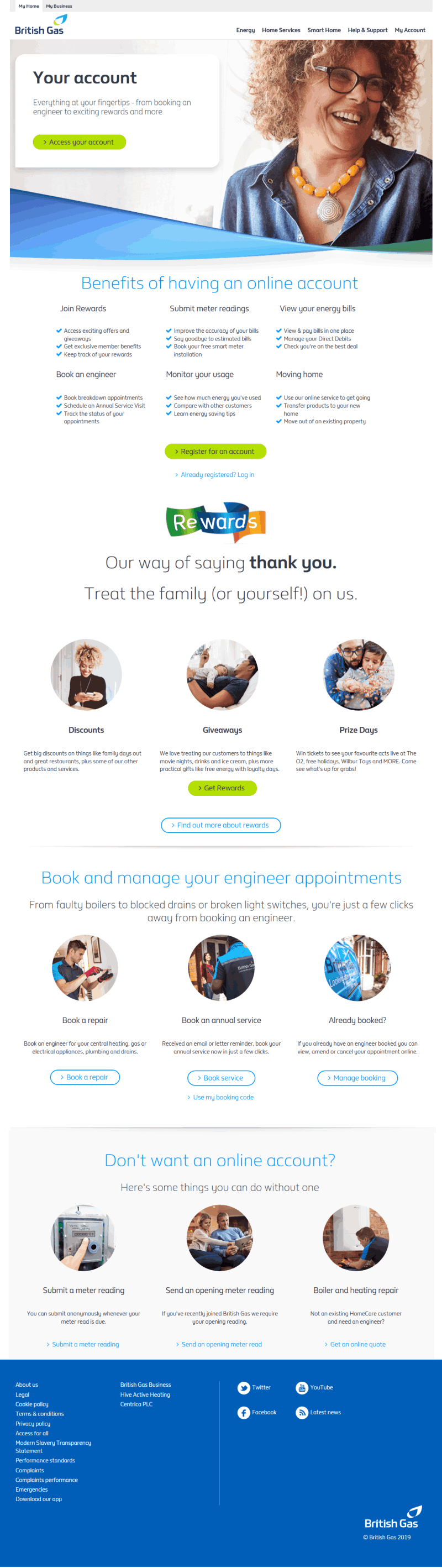


The Enabling New Partnership project focused on reviving British Gas's home energy services division as it faced steep competition from rivals during the winter months of 2018. The business had expected better performance and ultimately the dissapointing sales figures led to a new partnership initiative to address the problems. A deal was struck with other top UK businesses such as Sky and Sainsbury to work together in a collaborative marketing campaign that will give each party access to sell to the others customers'. This is a phased journey to evolve and grow new digital sales channels that will target new home energy users. The campaign also required drastic improvements to specific areas of the BG website which is were this project comes in. The project scope included improving the look and feel and user experience on the Boiler and Heating sales and services subsite to redesign the user journey, typography and layout. In addition, designing customizable promotional campaigns materials such as emails templates and banners with a focus on user needs and optimum user experience. The project team consisted of nine developers (including two front end UI developers), two Business Analyst, four Testers (two offshore), a Product Owner/Project Manager, Scrum Master, UX Researcher and two UX/UI designers -including myself. The project was based on Agile.
For the research phase the team had a lot secondary research data available to pull from. This was coming from recent British Gas (BG) projects that shared the same user types within the site and related to similar products. Never-the-less we still insisted on gaining direct link to typical users to performe the user interviews. From these, we percieved that the call to action buttons where poorly labelled and often appeared at the wrong place. Also colour was poorly used to guide the users intuition, in terms of highlighting important sections. we kept records of these and other critical points which would be presented and shared with team and stakeholders when concluding the research.
This research phase was primarily handled by our in-house UX Researcher, but we, the UX/UI team were kept in the loop and were present during all user interviews. At the time, our main activity list included getting familiar with BG's strict digital design language, brand policies and sketch components library. Afterwards, I was interested in learning about user perception of the boiler and heating subsite. So in my spare time, I presented the site to friends and family members who had same demographics as our users. I got them to perform specific tasks such as sign-up for boiler services, request boiler breakdown cover, etc I was specifically interested in their experience with the current user journey and pain points from the layout. In addition to this, back in the office, I requested access to analytics data and was able to inspect the bounce rates, conversions and user behaviour on the site. It was reassuring to discover that most of the information i collected also reflected with those gathered by our reseacher back in the office.
During the research we were looking to understand why specific products from the range of product and services the business offered, had been performing poorly. We were able to gain good insight and had presented a comprehensive review from which we could make future judgements. We had also gained good understanding of whom our users were and kicked off the next phase by creating personas that represent these users.
We decided to create user personas that will be shared across the team because when done correctly, Personas will give the team a fantastic way to stay on the same page, glean insights that would otherwise remain hidden, and produce designs that bring true delight to their users. They included a home owner, a retiree, a none BG customer, and a student, all with different demographics attached. We created A3 posters of the personas and stuck these on the wall for easy reference. These personas were drawn from the research phase and represented BG's typical customer base for Boiler and Heating products and services. We had also collected the ten most common reasons why they visited our site and the pain points they experienced. We shared ideas during multiple brainstorming sessions where we also reviewed web analytics data to see the most common drop-off points in the order and sign-up journeys. The Information architecture and typography were not left out. Our aim was to identify the KPIs and to plot the best approach for optimizing user experience on the website. We produced a report complete with deliverables (such as revised task flow and user journey diagrams for the site). This was then presented by myself to all stakeholder parties to ensure we are all on the same page before progressing further..
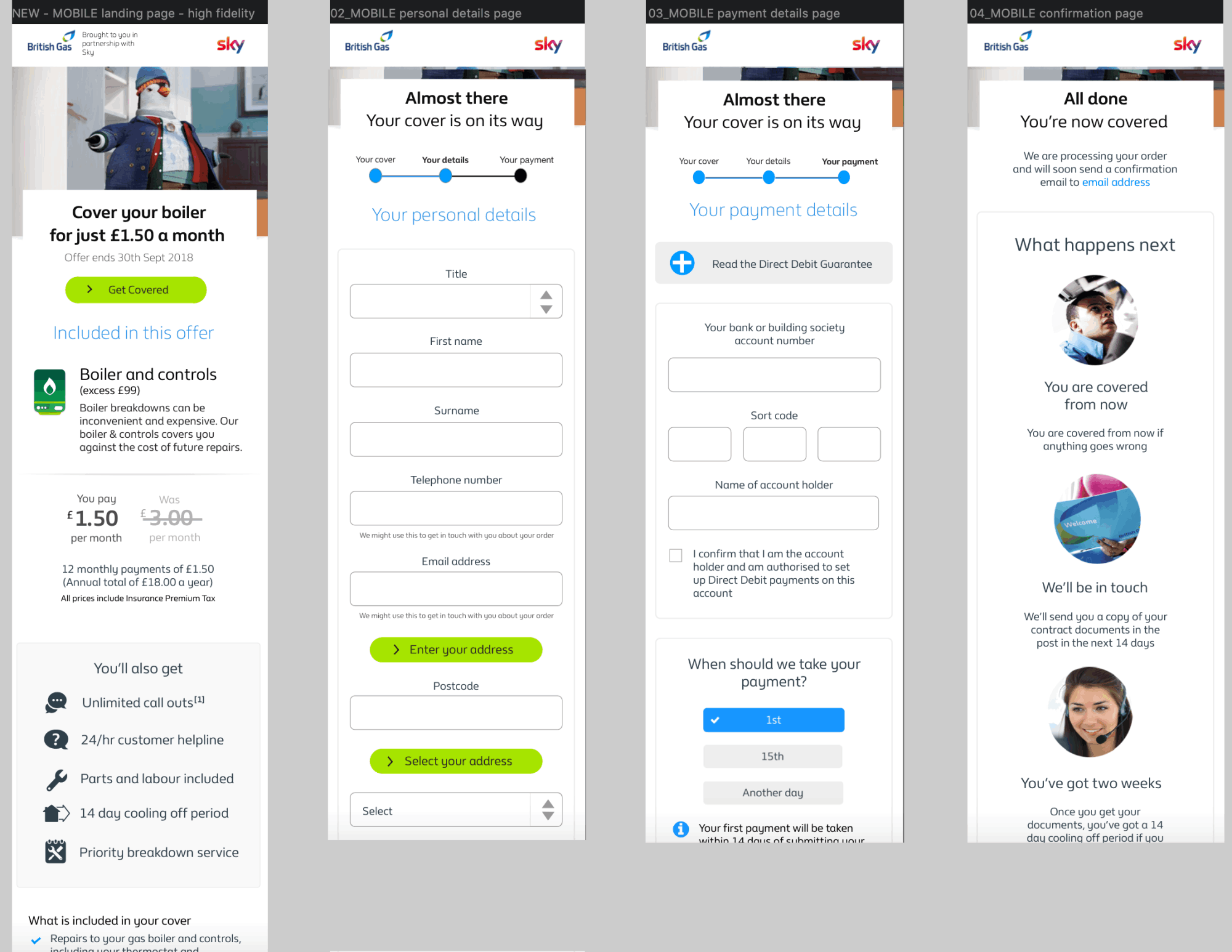
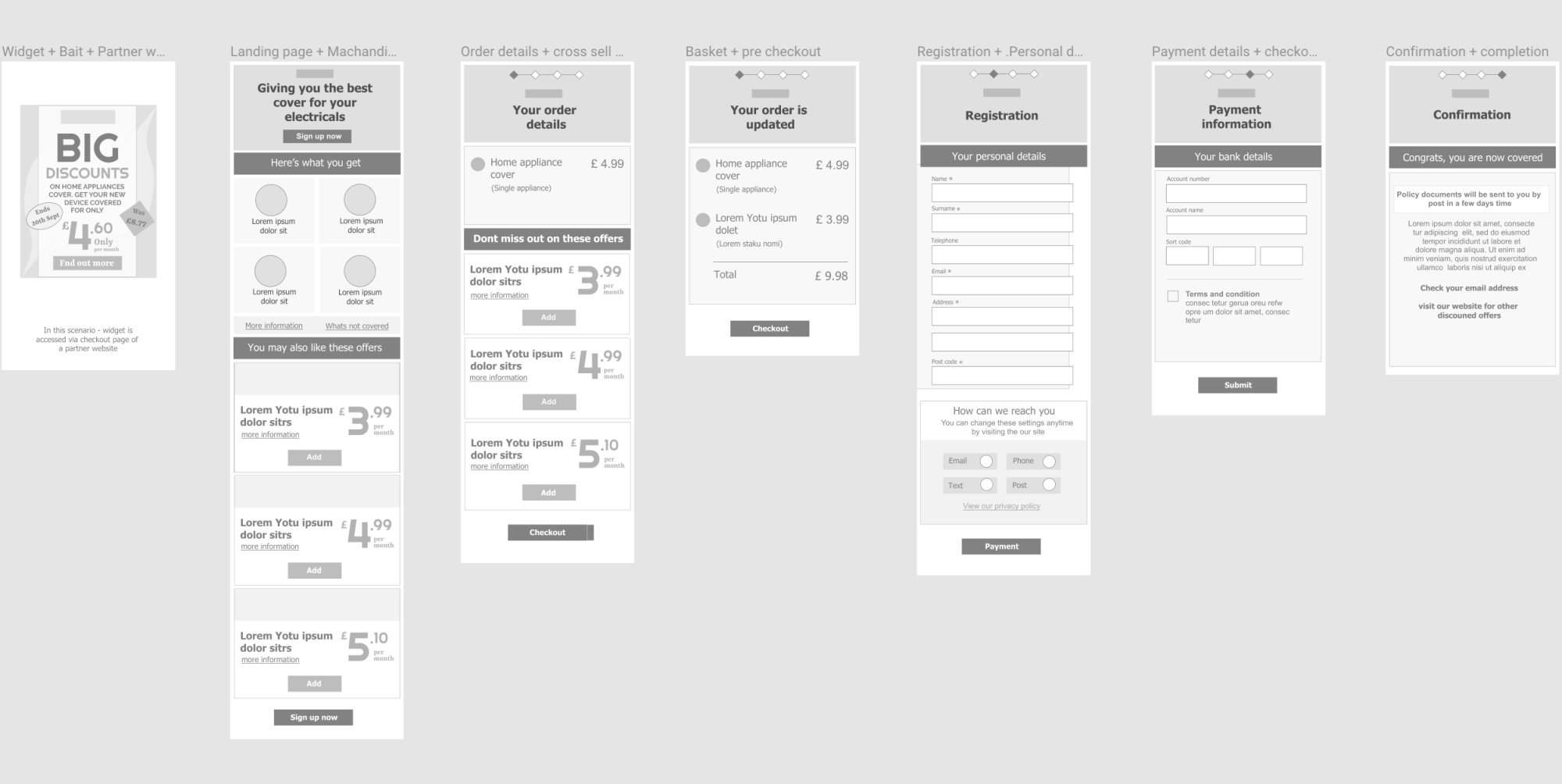
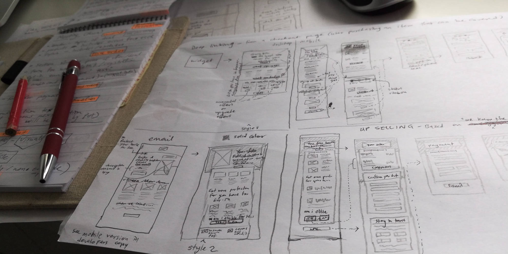
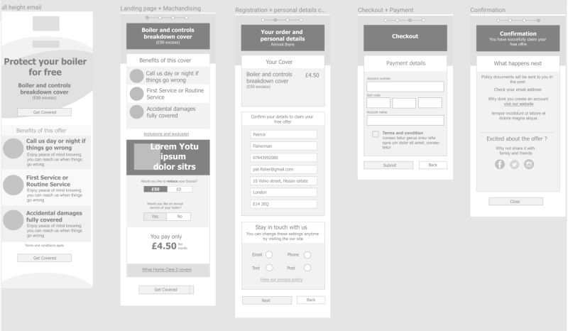
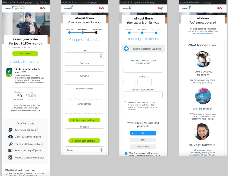
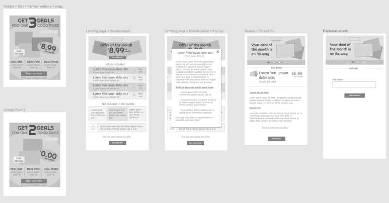
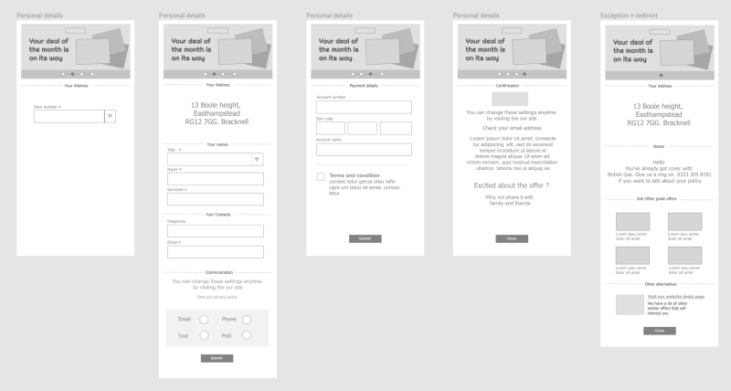
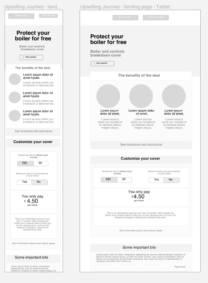
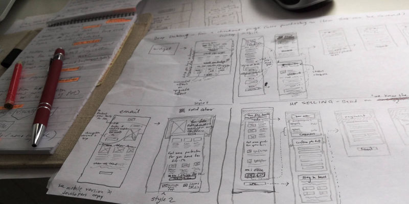
Following on from the stakeholder presentation which was well recieved, we discovered there were missing elements relating to compliance and business best practice policy in our proposed task flow. My colleague addressed this by revisited the drawing board to make amends, while I started off the design phase with some paper based sketches, Sketching my ideas on paper was usefull as it gave me freedom with my flow of thought and not being constrained by details. I toiled with a number of idea for the product main page and journey pages, While complying with BG design principles, i wanted to ensure that the pages were informative yet aesthetically pleasing. Example, for the product page I seperated product page headers into two sections left side for title and heading and right side for imagery. The idea was to enhance the layout by structuring the pages to make use of these regions where the user’s eyes visit the most, following the F-pattern and the Z-pattern, users eyes always start from the left. I was later rejoined by my colleague as we proceeded to create and analyse various ideas during design workshops. We eventually rounded up a three designs which we decided to explore further by producing the digital wireframes in Sketch. We continuously liaised with the developers, product owner and stakeholders to ensure we were all on the same page. Following further analysis and workshops, we rounded down to the most suitable design that covered the primary design goals, addressed all pain points and provided an optimized experience. I then finalised our chosen design prototypes in preparation for the testing phase,
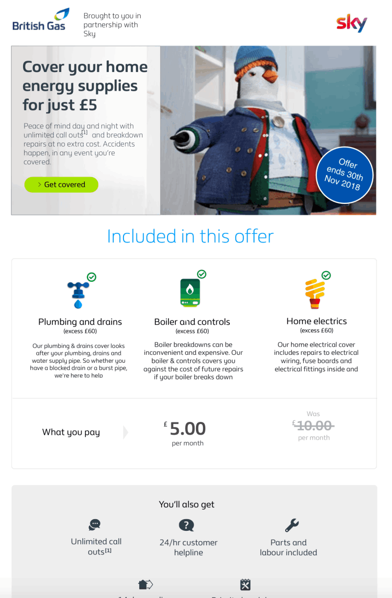
To commence preparation for testing we required clickable prototypes prepared in addition to acquiring test subjects, etc, Hence we split our activities once again so that I would prepare the clickable interface while my colleague reserved a place at BG's user testing lab and commenced the process of recruiting suitable test candidates using and agency online. To complete my task, I exported the .sketch file into Axure RP using a plugin acquired online and commenced transforming the UI to clickable prototypes for mobile tablet and desktop. We had a total of 10 users (covering the demographics we had set out earlier in the project). They were engaged over three testing sessions. During the tests we switched roles between observer and interviewer and ensured that the whole team were present and involved. By the end we had gathered essential insight to user perception of the pages and the journeys in question. Most of the feedback was positive including the fact that the journey was short and concise and users were kept informed through the journey. Never-the-less we had issues that needed addressing like the fact that a few users didnt scroll to the bottom of pages but clicked 'next' half-way through. In addition, for the partnership pages, there where questions regarding the two company logos at the header of the pages. Our findings were compiled into a report and presented to all stakeholders at a meeting. We also recieved opinions and input from the stakeholders after which I proceeded to apply the necessary amendements in my Prototypes in Axure. We repeated the test with fewer users and were satisfied with the responces we got this time and afterwards we recieved the go-ahead to move into development phase.
Working with the developers, I suggested we use Zeplin to share design assets and to streamline communication flow. This helped us by-passed the need for creation of style guides, as we continued our work by provided them design support through-out the development sprints. I had enjoyed working on this project and made some new friends. By the end, I had gained lots of new knowledge that would help me grow my skills. It was also a breath of fresh air as it was my first contract role after many years in a permanent UX role.