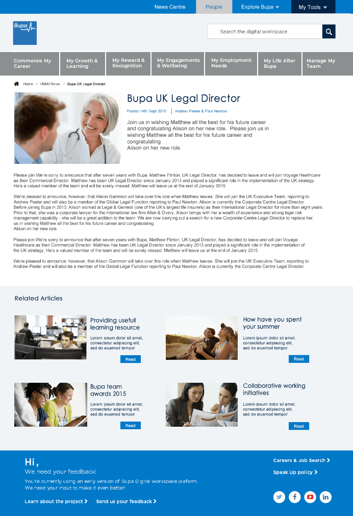
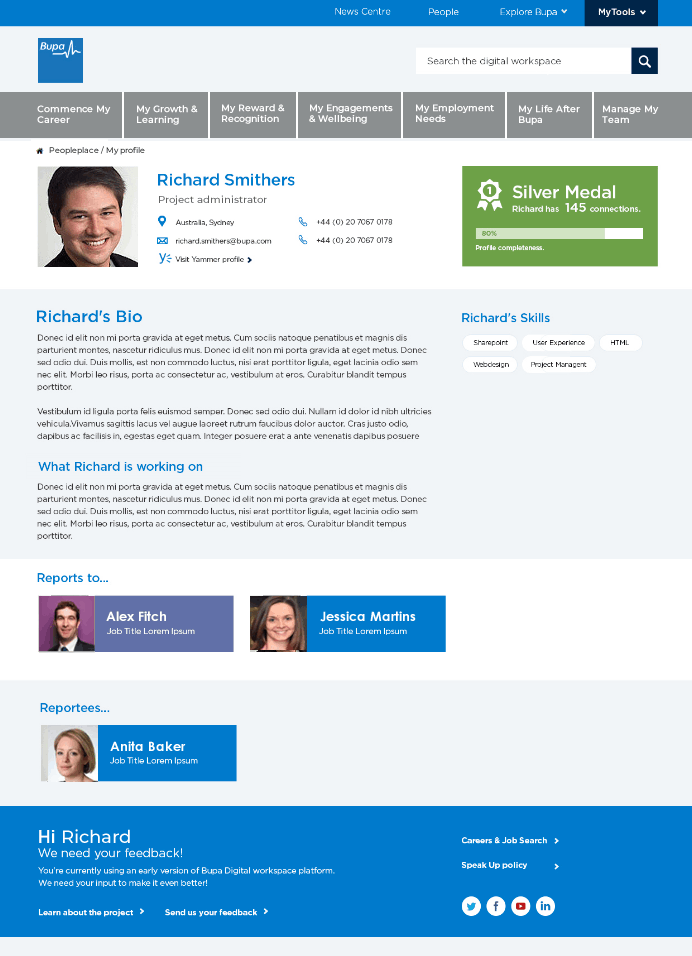
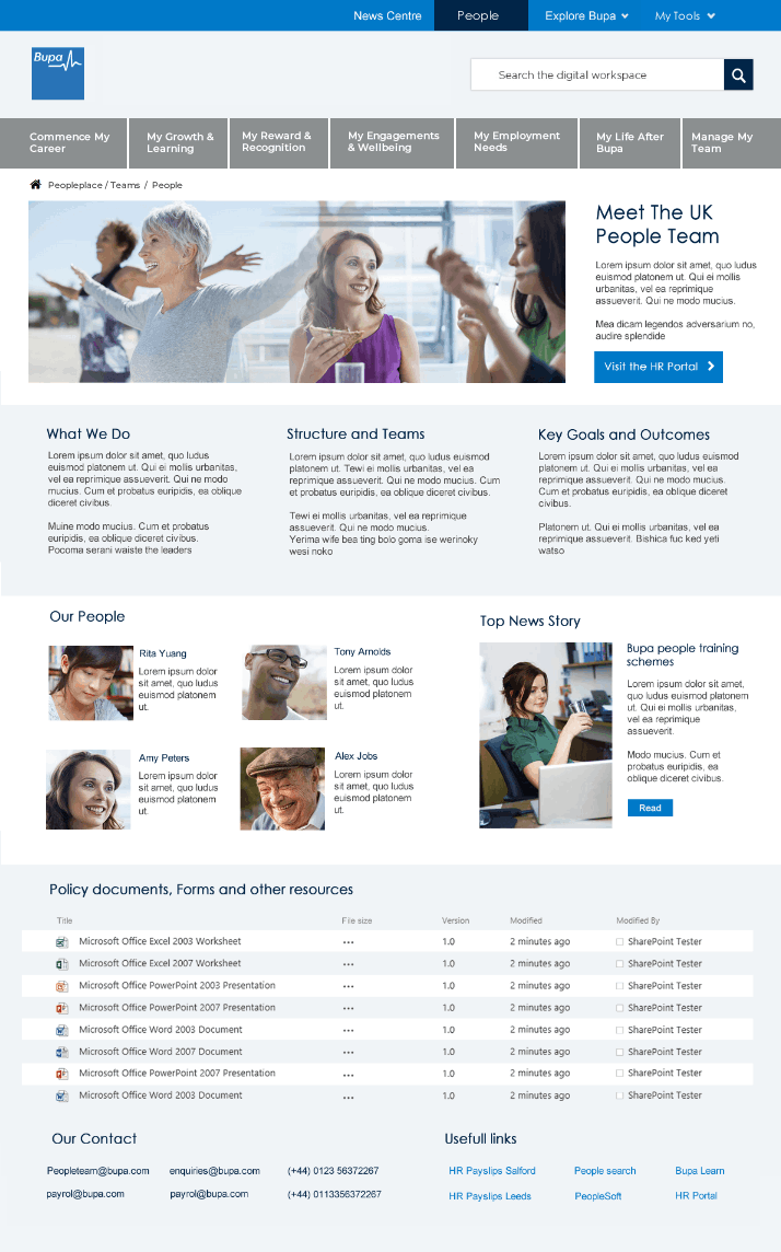
Peopleplace is a new intranet portal operated by Bupa’s human resources division. It enabled over 20000 UK employees to access and process information such as expenses, payroll, benefits, pay slips, etc. It also holds and provides access to hundreds of documents regarding policies and best practice for staff reference.
The problem:
Before the inception of the portal, employee services were directly handled by the HR and Communications team over the phone and documents were scattered across various servers and links had to be provided over the phone upon request. User authentication had to be done manually. Example, for each document request sent to HR, the requester had to provide an email from his or her line manager. In an attempt to quickly resolve the problem, the HR teams had created a site they named Oneplace. They had dumped all commonly requested documents in a database and made the links available across 3 webpages. This was not manageable as Oneplace did not have a landing page, no taxonomy and still no user authentication. Hence budget was set aside to build a feasible solution that will fully address the problem.
The new system would use SharePoint Office365 for authentication purposes and the team consisted of a Project manager, SharePoint Enterprise Architect, myself and one other as UX and UI designers, 4 developers and 2 testers.
After the kick-off meeting, we started off with stakeholder interviews to gain further clarity. Our discussion covered documents range, migration to SharePoint, Source control, layout, and content structuring. This helped us ensure that we had full clarity on what they wanted and helped us cover additional questions we had.
Some notes we took away from this include.
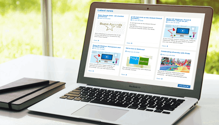
1. Need to have a homepage with news and promotional sections and should make a great first impression
2. Employee journey should be broken into subcategories
3. Users should be able to gain access to the subcategories via a secondary navigation area directly from the home page
4. All documents should be indexed for searching.
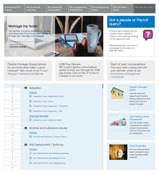
5. An additional section is required for managers to provide policy documents for reference purposes, to be operated by the Management Advisory Team.
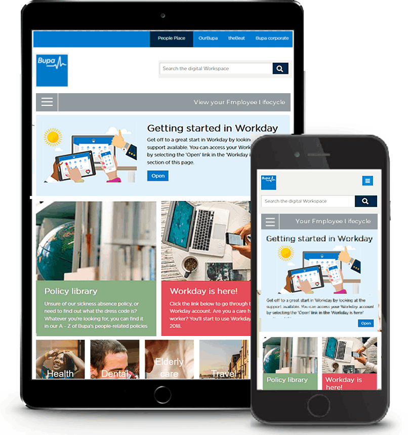
6. Users visiting the site from their work PC don’t require authentication if signed in on their machine. and should have a personalized experience.
7. Should support the business model and stay consistent with its brand policies.
User interviews
We were able to pick suitable participants from across the office floors. We used a participant screener one of our main criteria was that users’ must have had experiences of using Oneplace as well as contacting HR with common queries. We had over 20 users to speak with and the process and the feedback collation was scheduled for and completed within 2weeks. We wanted to know how they will perceive a web intranet solution that provided a user friendly reference point for employment needs, what difficulties they experienced, their most common queries to HR and how they would go about accessing data within a web portal. The responces pointed out that they wanted a consistent reference platform that provides a quick and easy path to policy documents and other data thats user friendly and intuitive.
Structuring contents
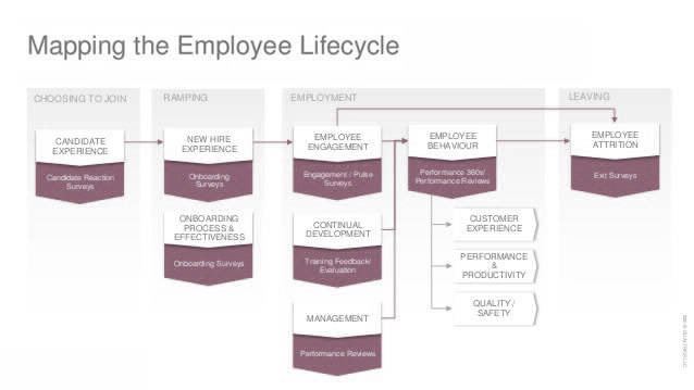
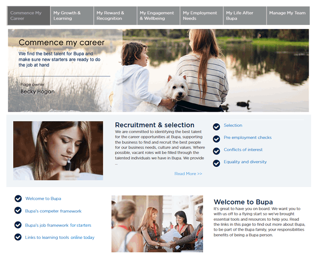
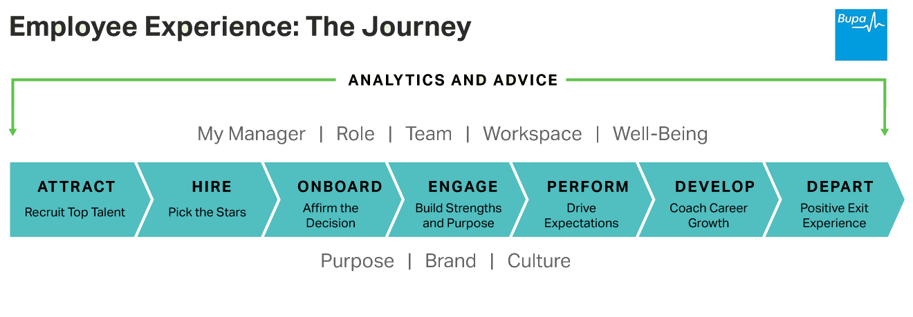
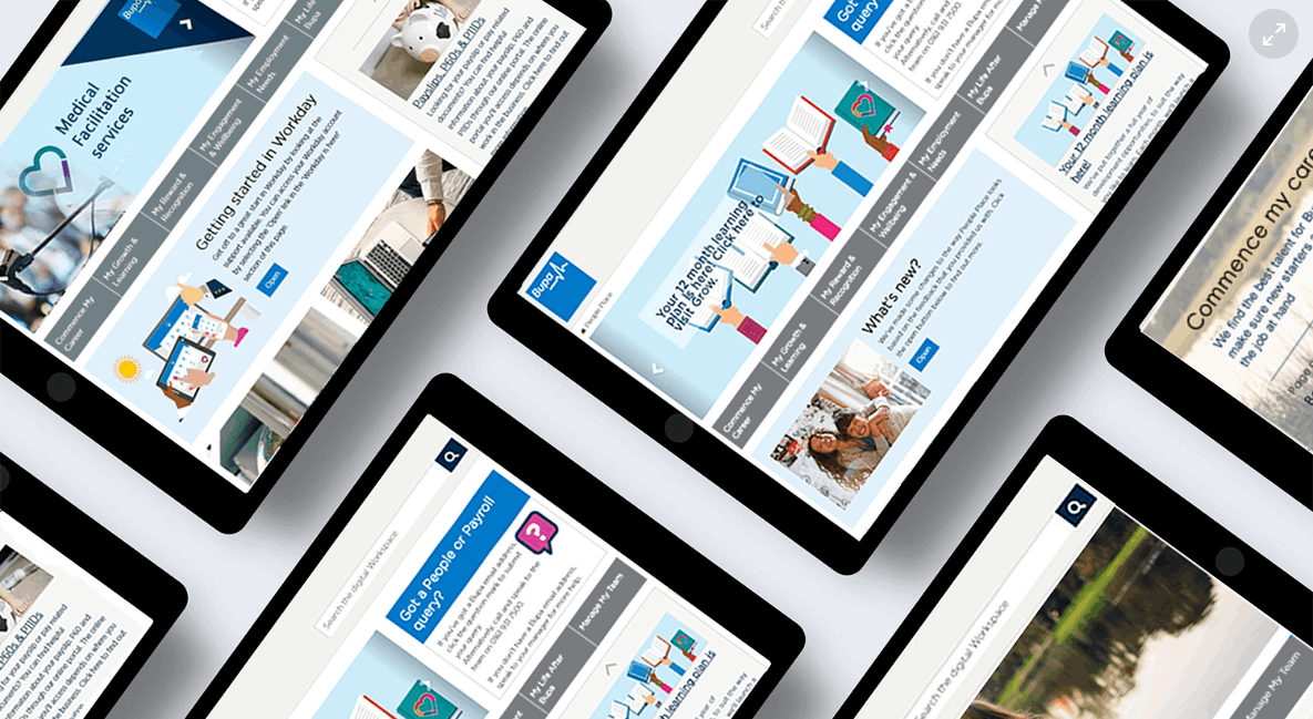
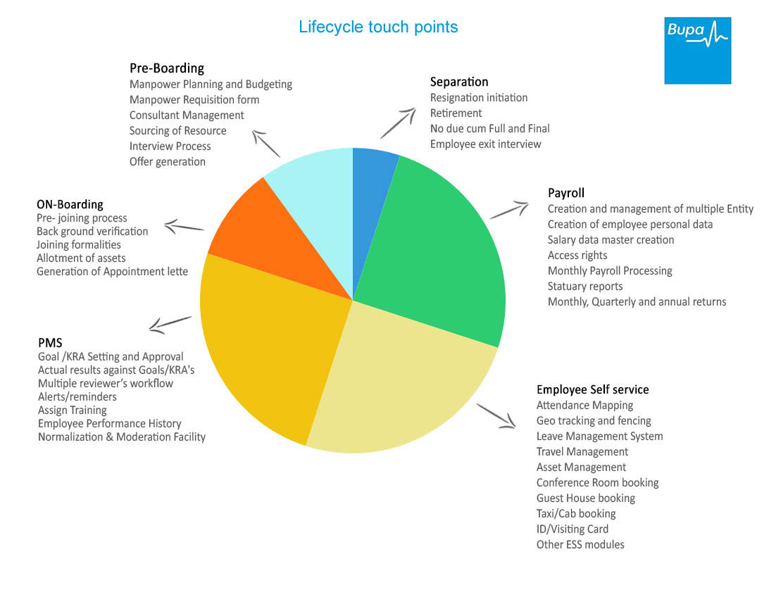
We created a number of personas based on common user profiles from across the office for use later. We worked on cataloguing the vast amount of content and files by creating various site map options to workout which approach worked best for users. In the end we decided on grouping all sections into 7 categories which we called the employee lifecycle. This then contained subcategories which we labelled as Level2. Further within level2, we created a final level where documents are directly accessible, labelled as level3 (see sitemap illustration)
Employee lifecycle:
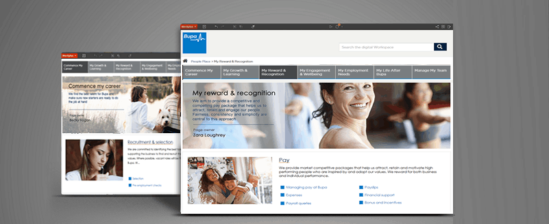
1. Commence my career
2. My Growth & Learning
3. My Reward & Recognition
4. My Engagement & Wellbeing
5. My Employment Needs
6. My Life After Bupa
7. Manage My Team (for managers)
Card sorting
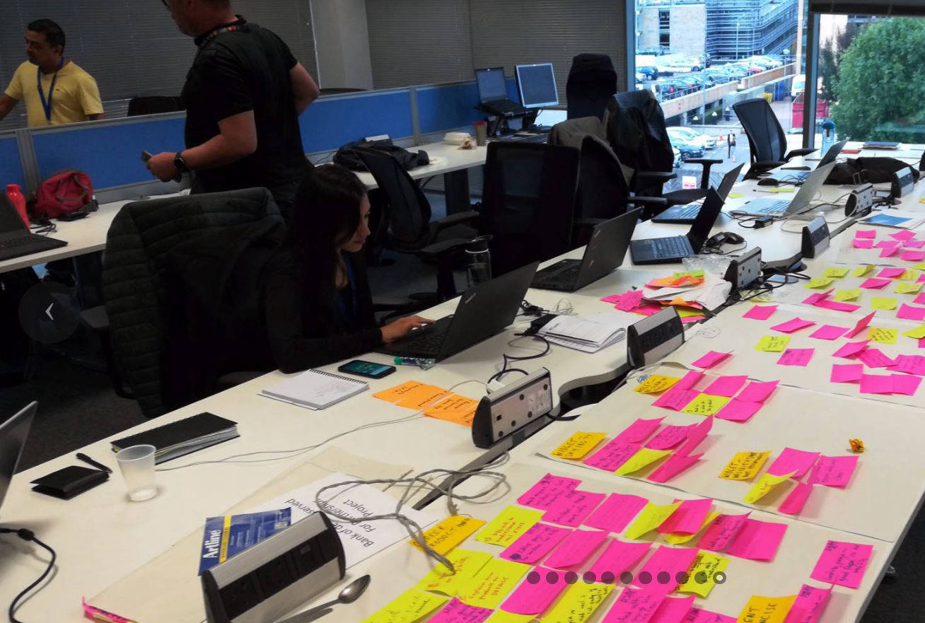
We used card sorting to determine where users will expect level2 and 3 topics to be placed. For each session we provided our users a pile of pre-labelled sticky notes to place within one of the 7 sections to form level2 and further within level2 sections to form level3. This was useful in helping us understand our users' expectations and their understanding of the page heading labels which we had to amend in some cases to enable users' determine where each sticky note belonged. We took notes but in addition, at the end of each session we used our phones to take pictures for quick reference in future.
Tree testing:
We performed tree testing to help us to evaluate the findability of topics that will be on the website as part of the information architecture. This was useful as it presented participants with realistic task scenarios while we observed how they worked their way through. It helped us to further organize our structure. We confirmed the changes by re- testing with different sets of users to be certain. It allowed us to isolate problems in findability in our taxonomy.
Paper prototypes
We needed to start testing for the interface, so that we can learn about pain points early and start addressing them. We took screenshots of the existing HR Oneplace site structure taking note of user journeys and alternative click-through. We then created 3 paper prototypes to serve as landing pages, each with 3 different layout structures. We chose paper prototyping because it enabled user interaction. I served as the facilitator, with 2 colleagues as observers and then the user. We had multiple sessions with various user types. Example, managers, technical and non-technical staff as well as practitioner’s like nursing assistants and doctors within the business. Main focus of these prototypes was to learn what layout structure works best for levels 2 and 3 as well as to learn which one of the following best suits our users.
• An Employee lifecycle that uses a tree based folder structure (was not favoured)
• Integrated employee lifecycle built into the main navigation (Not favoured by users)
• A horizontal navigation bar displaying the 7 sections of the Employee lifecycle (This was widely preferred by our test subjects)
It was obvious that users wanted a process that required the least effort and indeed having the lifecycle links as a nav bar in the homepage actually worked best as the tree option could be confusing and won't work well from page to page. With these conclusions, we then created more level2 and level3 paper prototypes pages. This was to enable further testing using scenarios. The user scenario tests further revealed some minor bits we had missed, like ensuring document file size was displayed so users on mobile data or slow web access don’t get stuck.
Hi fidelity prototypes
For our high fidelity prototypes, we used Figma. I found it to be refreshing as I could work on a single file simultaneously with other team members in real-time. Upon completing the prototyping, we assumed the role of users (based on personas created earlier) and created ten user scenarios to test with. This was to enable us explore how our prototypes could function, or fail, in particular situations. We successfully complete this without any issue but to verify this, we carried out the tests again with real users by asking them to perform same specific tasks. We then rectified the previously unseen issues that were revealed by our users and Iterated.
Testing
The completed design was passed to development after sign-off from the product owners. We monitored the development which used agile principles, with show-and-tell sessions every 2 weeks. Our QA tester carried out all necessary tests for the dev team and upon finalizing, the system was deployed in UAT server for full usability test.
We went through so many mockups in search of the one that would tick all the boxes. During this process it’s important to always bear in mind that your most sensible-looking ideas may have to be scrapped, mindless of how much time you've put into it. By having this in mind, you remain flexible and less likely to fight your team members. We had greate design ideations, and the output of our teamwork was a solution that addressed the issue at hand and satisfied both the users' and product owner.